
A premium visual identity does not automatically create premium content. Plenty of expensive-looking brands still publish work that feels forgettable.
A lot of premium brands assume their content will feel premium because the brand already looks premium. Nice typography, polished photography, and a sleek website can absolutely raise perception, but they do not solve weak communication. Content still has to earn attention on its own.
The common mistake is confusing production value with strategic value. A piece of content can be beautifully edited and still say nothing useful. It can look expensive and still feel disposable. Audiences notice that gap faster than brands expect.
When premium brands get content wrong, it usually happens in one of four ways. The first is over-stylisation. Everything is designed to look elegant, but the message is so vague that people finish the piece without knowing what it meant. The second is inconsistency. The brand voice on the website sounds measured and assured, then the social content starts chasing whatever format is currently trending. The third is overproduction. Content becomes so polished that it loses humanity and stops feeling connected to a real point of view. The fourth is under-thinking. The team produces a lot, but no one has defined the role each asset is supposed to play.
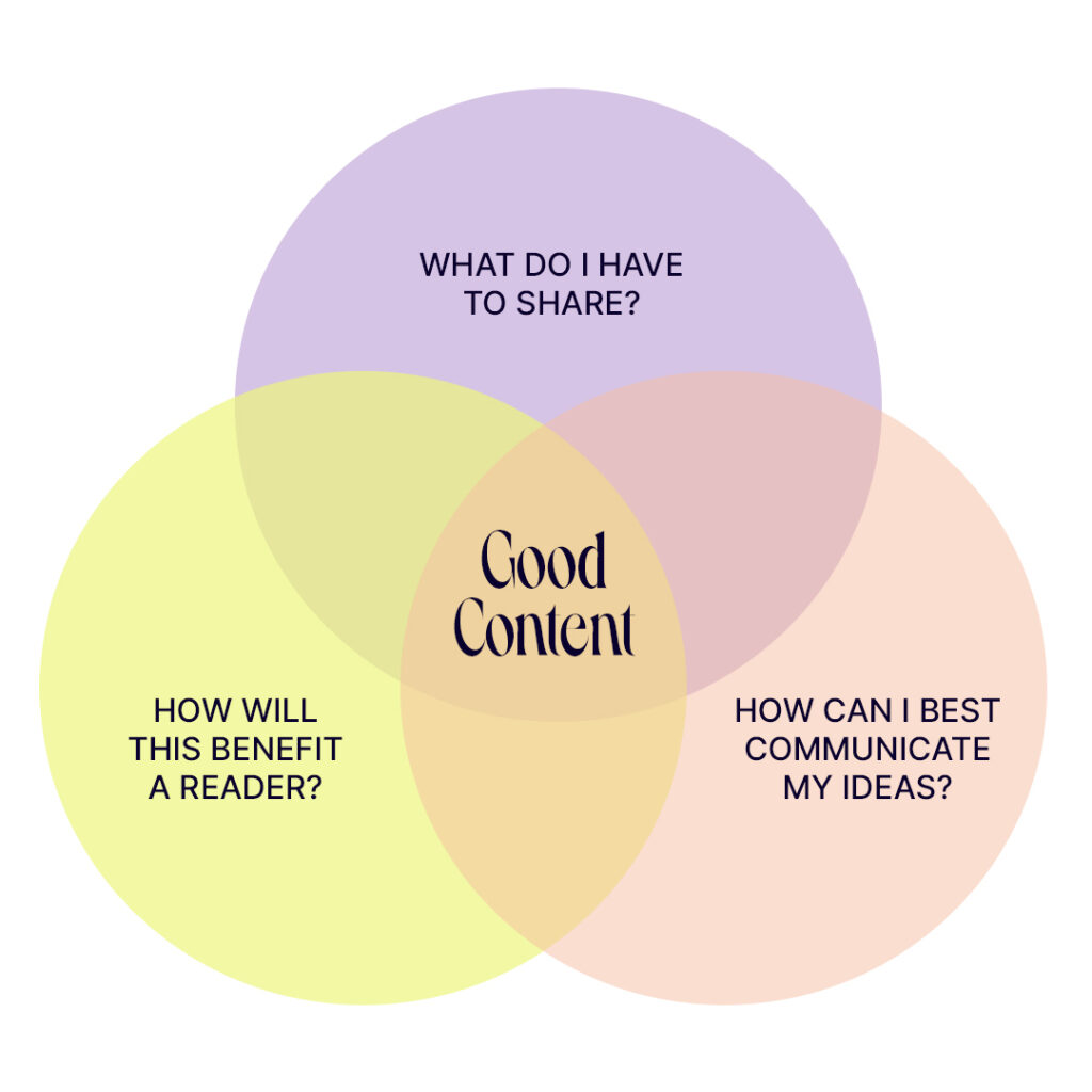
Premium brands do better when they accept that taste is only part of the equation. The other part is intention. What is this content supposed to do? Build authority? Support a launch? Humanise a founder? Clarify the offer? Shape public perception? Different goals demand different structures. When the goal is unclear, the content tends to drift into attractive emptiness.
Another issue is distance from the audience. Some brands become so protective of their image that they stop sounding human. They flatten everything into neutral brand-safe language and end up publishing content that feels technically polished but emotionally absent. That is a problem because premium should not mean sterile. It should mean controlled, deliberate, and well judged.
There is also a practical workflow issue. In many companies, the team handling visual identity is not the same team handling day-to-day content. Without a shared messaging system, quality drops fast. One part of the brand is operating from a clear standard while another part is improvising under pressure. The result is a brand that looks expensive at the top and messy in motion.
The fix is not to post less or chase perfection. It is to put stronger thinking behind the work. Define the message first. Decide what the brand should consistently sound like. Build a content structure that suits the channels you actually use. Then create assets that respect the brand’s level without turning every post into a museum display.
The strongest premium content usually feels simple on the surface. It is clear, restrained, and intentional. It respects aesthetics, but it does not hide behind them. It gives the audience something to understand, something to feel, or something to remember. That is what keeps premium from becoming purely decorative.
A premium brand does not need more content for the sake of motion. It needs content that protects the standard, supports the business, and makes the brand easier to recognise in public. That is a very different brief.